Shop & Ship Relaunch

Case Study
Shop & Ship Relaunch
Turning a shipping utility into a web app for the global shopper.
Shop & Ship gave customers international virtual addresses to shop globally and ship purchases home through Aramex, but its website had not yet become the essential service hub customers needed after signup: tracking, rates, payments, support and account tools. The brand needed more than a redesign. It needed a behaviour-led platform that could explain the service, convert new users, support members and give global shoppers a reason to return.
Client
Shop & Ship by Aramex
Year
2016
Category
Logistics
Services
At a Glance
- CategoryLogistics
- DeliveredDigital Product & Brand Campaign
In their words
Testimonial
Managing a global brand that needs to appeal to an extremely diverse customer background, culture and interests has always been one of our biggest challenges at Shop & Ship, yet the concept Almost Impossible came up with, implemented in the physical world and later translated to the digital environment on our website, the videos and across content elements was a very elegant, well thought off, and meticulously applied piece of work that stayed with us for over five years and helped us refine and elevate the brand even further.
At a glance
Rebuilding a global shipping service around behaviour, conversion and return visits
Shop & Ship needed a digital experience that could serve different users at different moments.
- New users needed to understand the service quickly
- Existing members needed easier access to everyday tools
- Returning users needed useful shortcuts and reasons to re-engage
- Prospective customers needed a smoother path to signup
Almost Impossible rebuilt the experience around three connected challenges:
- Make the service easier to understand
- Make the platform easier to use
- Make the brand easier to remember
The work included UX strategy, information architecture, responsive UI design, content strategy, website copywriting, signup strategy, customer account tools, front-end development, CMS integration support, member migration support and a handcrafted campaign system that lived across the website, video, social, EDMs and content.
- UX Strategy
- Website Redesign
- Information Architecture
- UI Design
- Responsive Web Design
- Content Strategy
- Website Copywriting
- Customer Portal Experience
- Signup Conversion Strategy
- Front-end Development
- CMS Integration
- Digital Campaign
- Stop-motion Content
- Paper-craft Art Direction
- SEO-friendly Website Architecture

We produced a stop-motion infomercial using handcrafted paper art to educate prospective Shop & Ship members.
01 - The Brief
A global shipping service needed a digital platform built for conversion, utility and repeat use
Shop & Ship allowed customers to shop from international markets, use local virtual addresses, and receive purchases in countries where many retailers did not directly deliver.
The service proposition was strong.
The digital experience needed to work harder.
The brief was to improve online presence, increase visibility in relevant searches, consolidate content, increase registered customers, and engage existing users with more useful content and online shopping options. The platform had to be user-friendly, visually pleasing, SEO-friendly, responsive, informative, useful and secure.
This was not a cosmetic redesign.
It was a conversion, utility and engagement challenge for a global logistics brand.
- Responsive Website
- PCI-DSS Compliant
- OWASP Compliant
- Sitefinity CMS Compatible
- Multilingual
- Content Assets
- Social Media Assets
- Relaunch Campaign
02 — The tension we challenged
The service was useful.
The website had become optional.
Once a customer saved their virtual addresses, the website had not yet given them a strong reason to return. The opportunity was to turn essential service needs, tracking, rates, payments, updates, support and account tools, into a more useful customer hub.
That behaviour became the insight.
“As a Shop & Ship user, I had joined years earlier, saved my virtual addresses elsewhere, and only returned when I needed to track or manage something. If I was not actively shipping, there was no need to visit.”
- Shop & Ship member since 2008
The audit confirmed the same issue across the wider experience.
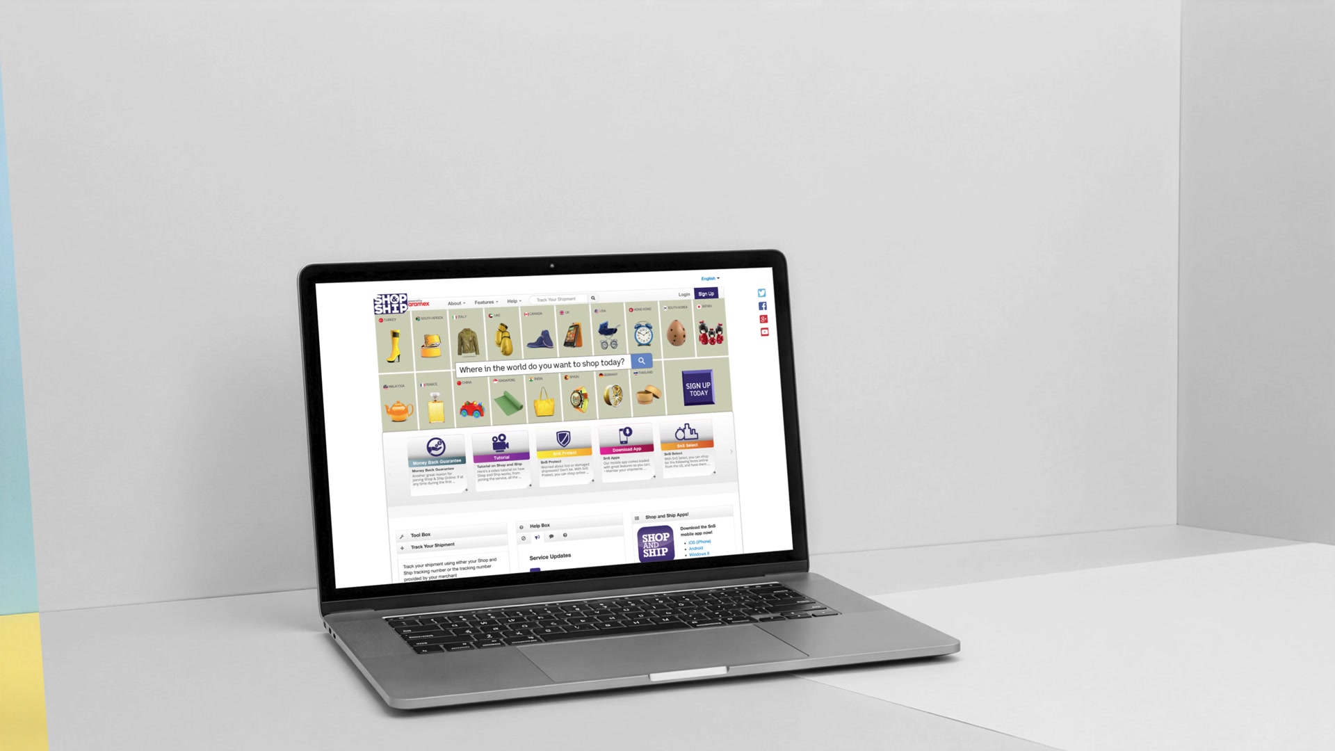
First-time visitors were not being educated clearly enough. The homepage felt cluttered and did not make it obvious where to start.
For existing users, the most important tools, such as shipment tracking, rate calculation and service updates, were sitting too low in the experience.
Useful content, including the shopping directory, was hidden behind too many layers. The site also suffered from inconsistent menu behaviours and design shifts, making it feel like more than one experience.

This was the Define moment:
The website did not simply need to look better. It needed to earn its place in the customer’s shopping behaviour.
03 — The strategic reframe
Shop & Ship did not need to behave only like a logistics utility
It could become a global shopping companion.
That reframe changed the website’s job.
- For first-time users, the platform had to educate quickly and build confidence
- For members, it had to make account management easier
- For returning users, it had to surface useful shortcuts
- For future shopping-incentive buyers, it had to create reasons to browse, discover and return
The strategy identified three current user types:
- First-time visitors
- Registered visitors
- Registered users who preferred not to log in
It then introduced a fourth future-facing audience:
- Shopping incentive buyers, people who could be encouraged by relevant ideas, personalised offers and products they missed from home
The UX strategy introduced a future-facing shopping-inspiration layer, while the launched platform focused on rebuilding the core experience around clarity, utility, conversion and repeat use.
The goal was no longer just to help people ship what they had already bought.
It was to make Shop & Ship more useful before, during and after the purchase.

From utility to companion: the platform had to become useful before, during and after purchase.
04 — The Idea
Shop at a click.
Ship at a click.
The idea was to make global shopping feel as simple as the action that starts it.
- One click to shop
- One click to ship
- One platform to manage everything in between
For the product, this meant building a responsive web app for the global shopper: clear for new users, useful for members, and strong enough to support account management, tracking, rates, support and future content growth.
For the brand, it meant making logistics feel more human.
People travel the world through their hands when they shop online. They search, browse, click, buy and ship across borders. That behaviour inspired the visual world.
Instead of showing logistics as warehouses, trucks and boxes alone, we built a handcrafted paper-craft universe of products, destinations, packages, scales, receipts, address books and delivery moments.
The line gave the platform its clarity.
The craft gave the brand its warmth.

05 — What we made
Handcrafted love
A UX strategy built around why people visit
We mapped the platform around user intent.
- First-time visitors needed to understand the service and feel confident enough to join
- Registered users needed direct access to the tools they used most
- Returning users who did not want to log in needed faster routes to common tasks
The UX proposal created different experiences for these visitor states, each supported by shopping-incentive thinking.
For first-time visitors, the strategy focused on explaining Shop & Ship clearly, showing how it worked, presenting what users could get and encouraging signup.
For returning users, the strategy explored recognising behaviour and pushing the most-used feature upfront.
For logged-in users, it proposed dynamic content based on shopping habits, recent purchases, preferred locations and frequently used features.
The platform stopped treating every visitor the same.
It began responding to why they came.
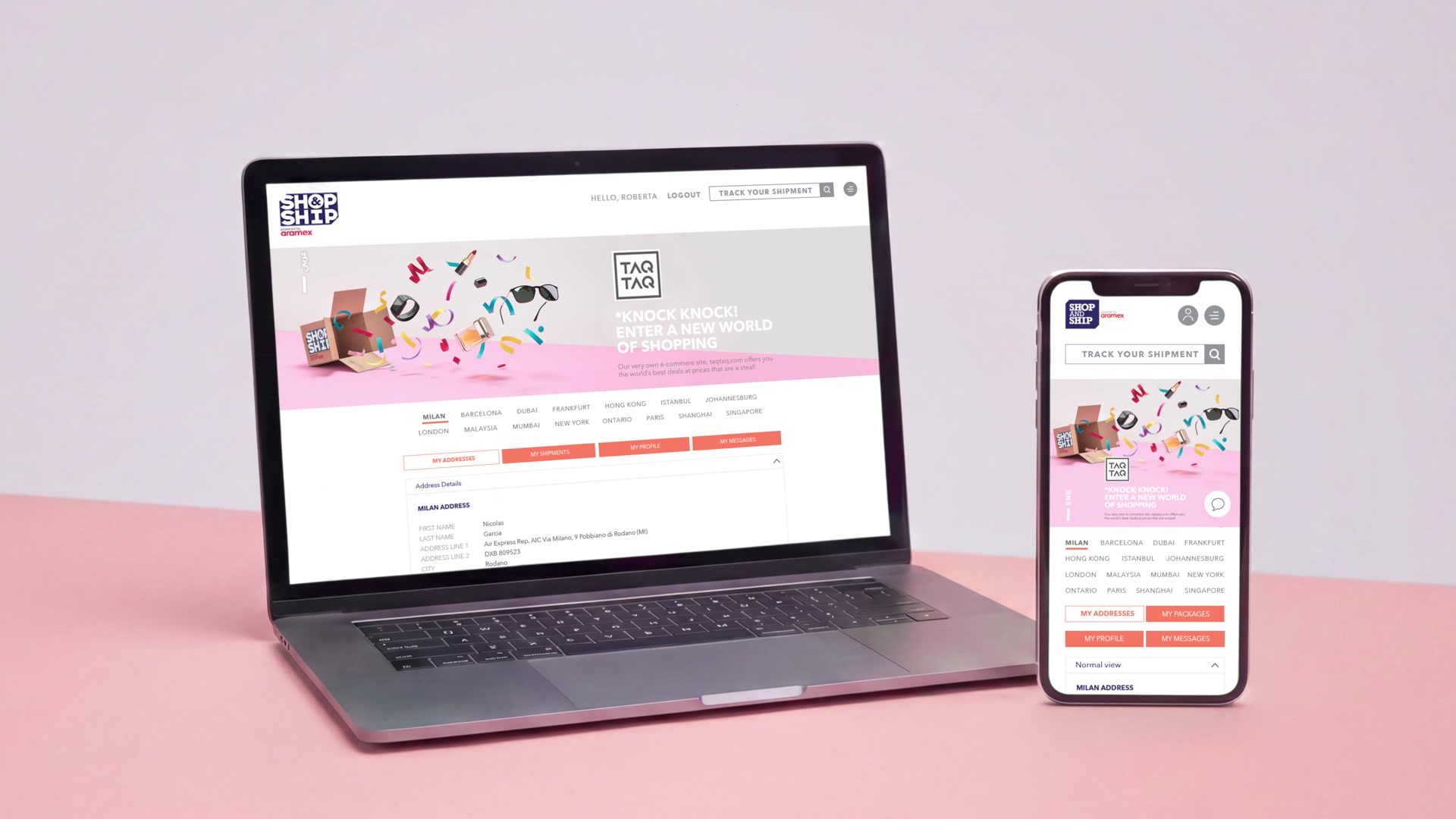
A customer account platform that gave members a reason to return
The customer profile became the heart of the experience.
Members could manage virtual addresses, calculate shipping, view destinations, access account information, upload invoices, raise support tickets, report issues, file lost-package claims and manage requests.
This turned the website into a practical control centre for the customer’s global shopping activity.
That mattered because Shop & Ship’s value did not end at signup. It continued through every shipment, address, invoice, claim, support request and delivery update.
The easier those moments became to manage, the more valuable the service became.
A signup strategy designed around hesitation, recovery and conversion
The signup journey was treated as a conversion system.
A deeper analytics review showed that many users clicked to sign up, then left almost immediately. The issue was not only the homepage. Users were dropping out deeper in the journey, especially around profile and payment steps.
The strategy focused on three scenarios: people who complete signup, people who start registration but quit, and people who browse the website but never sign up.
For active signups, the strategy improved the flow with easier account creation, friendlier language, rewards for completion, a sense of urgency and stronger confidence cues.
For users who abandoned the process, it proposed targeted recovery emails based on where they dropped off. At the payment step, the strategy addressed hesitation directly by reminding users about the money-back guarantee.
For users who browsed but never acted, the strategy closed dead-end pages with contextual signup prompts.
Every informative page had to become a conversion opportunity.
Not aggressively.
Intelligently.
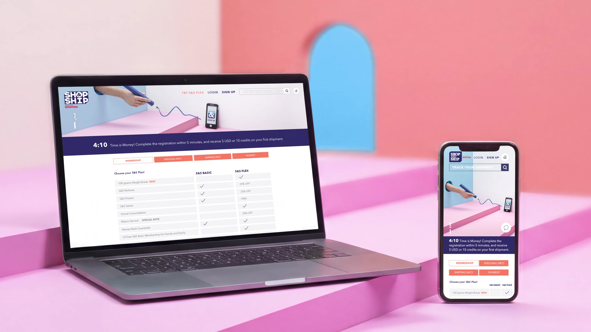
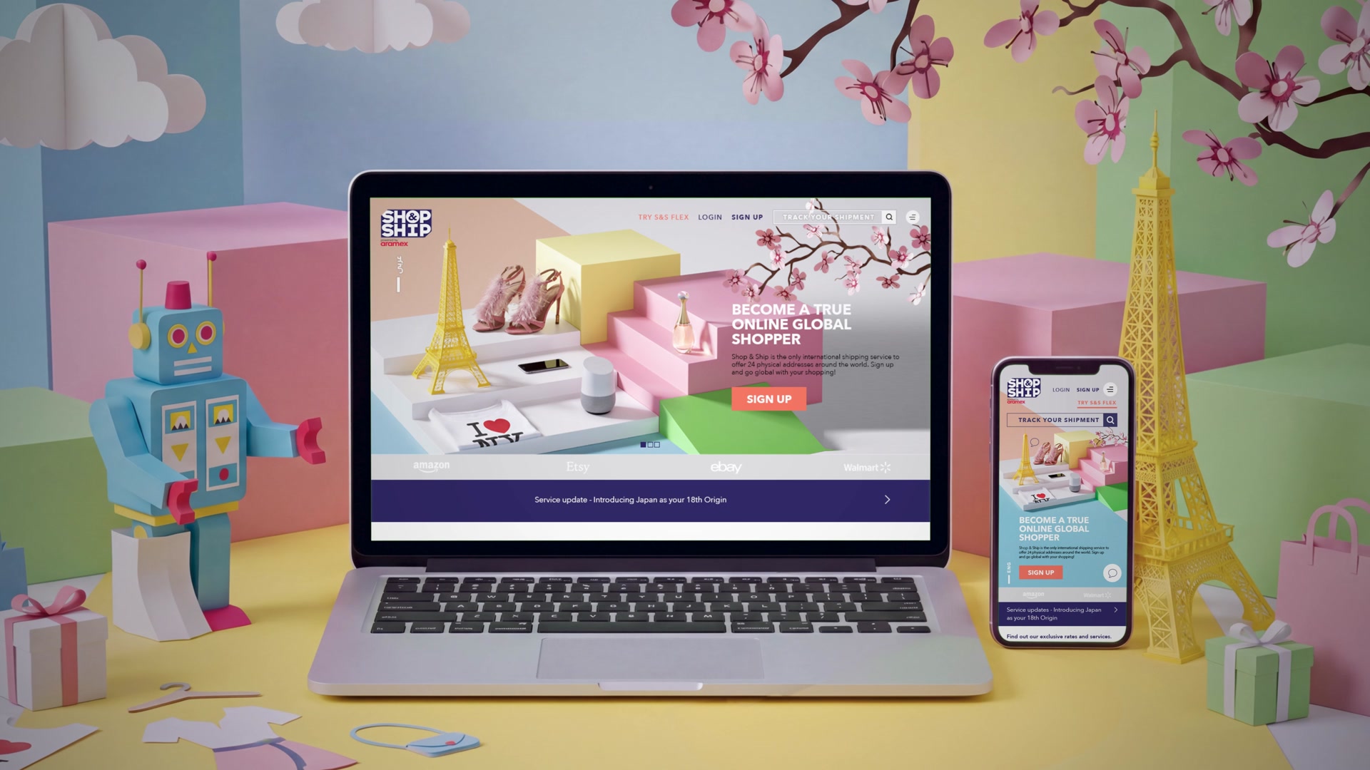
A responsive, enterprise-ready web app
The platform had to work across devices and within a robust enterprise environment.
Mobile already represented a substantial share of traffic, but mobile conversion was lower than desktop. That made responsive design a business priority, not just a technical requirement.
The redesigned experience made key tasks easier across desktop and mobile: signup, tracking, rate calculation, address management, package status, invoice upload and support.
Almost Impossible developed the UX, UI, content and front-end experience, then collaborated with Shop & Ship’s internal technology team on implementation, migration, CMS integration, security testing and deployment.
This was the Deliver work:
Translating strategy, design and content into a secure, responsive platform for a global logistics business.
A handcrafted campaign world that made logistics feel human
A functional platform needed a memorable brand world.
The creative platform, “Shop at a click. Ship at a click.”, was extended into a handcrafted paper-craft system that made global shopping feel simple, tactile and joyful.
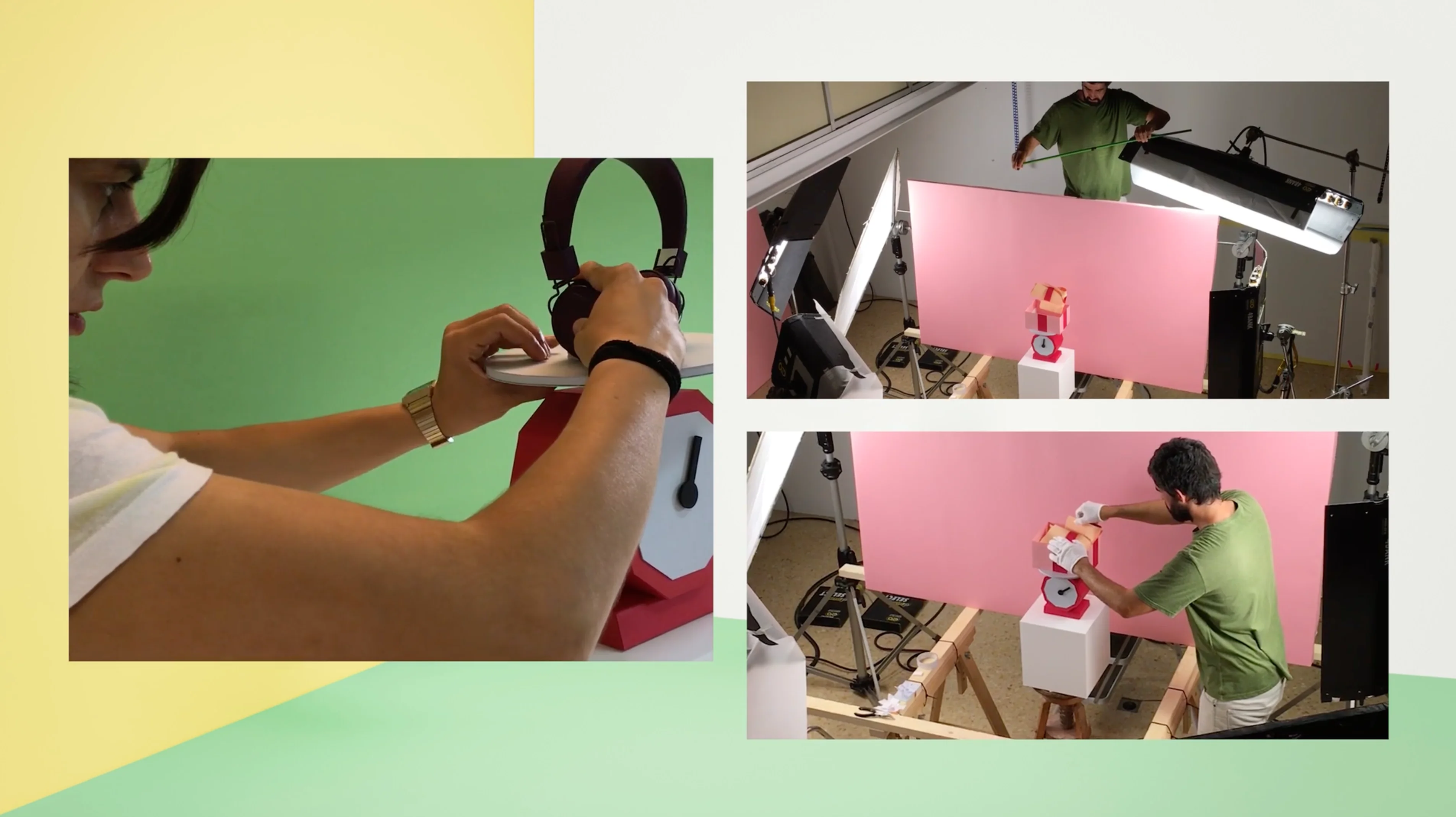
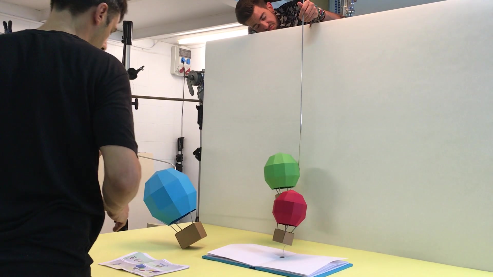
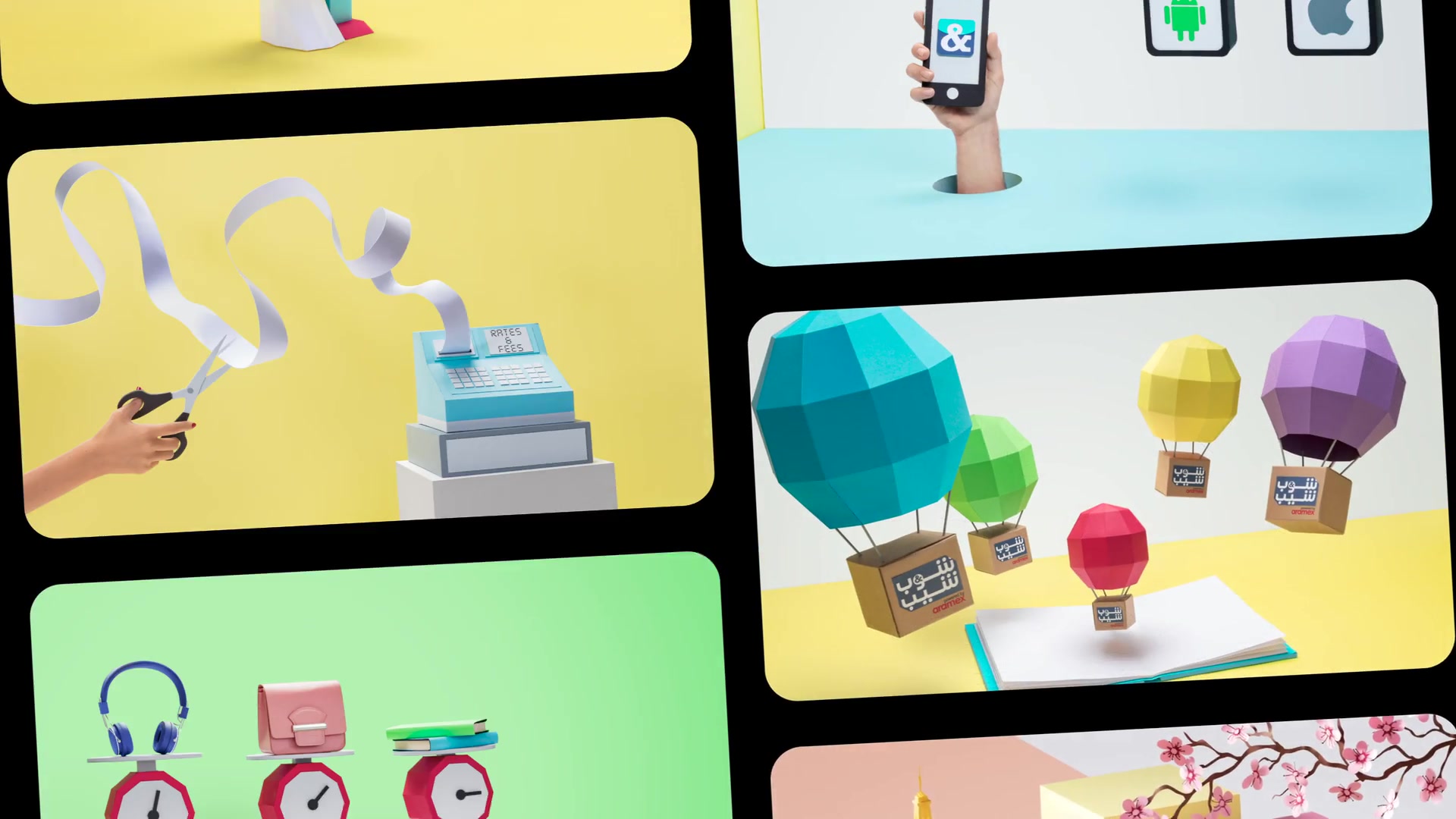
Working with a paper artist based in San Sebastián, Spain, we produced dozens of handcrafted paper-craft assets, each designed to explain a different part of the Shop & Ship experience.


Hot-air balloon boxes made global delivery feel light and borderless.

An open box turned global shopping into a joyful product-discovery moment.

Paper scales made shipment weight easier to understand.

A paper receipt and scissors turned rates and fees into a simple visual metaphor.


A drawn path towards a mobile screen made signup feel guided and achievable.

A magnifying glass over a package made tracking instantly understandable.

A paper robot gave the Protect service a memorable visual cue.
From concept sketches to paper craft to photoshoot.
These assets were not decorative.
They helped explain the service, create a distinctive visual language and give the brand a flexible content system across the website, infomercial, EDMs, social and campaign materials.
The stop-motion campaign then used this world to educate people who did not yet know a service like Shop & Ship existed.

From concept sketches to paper craft to photoshoot.

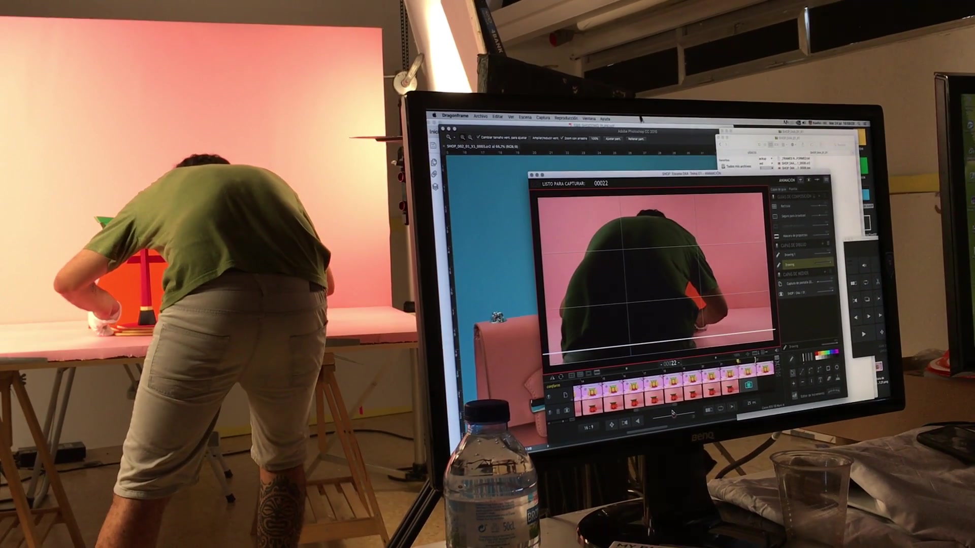
We spent nearly two weeks producing the handcrafted stop-motion infomercial.
From concept sketches to paper craft to photoshoot.
06 — How it showed up in the world
The new Shop & Ship platform launched as a clearer, more useful digital experience for global shoppers
The website helped users understand the service, sign up with greater confidence, manage virtual addresses, track shipments, calculate rates, upload invoices, raise tickets and manage support issues from a more coherent account environment.
The campaign gave that platform a recognisable voice and visual world.
The paper-craft assets appeared across the website, videos, digital content, EDMs, social posts and campaign materials. The system had enough range to keep working long after launch.
This is where the work began to Delight:
A complex shipping service became easier to use, easier to understand and easier to remember.

Shop & Ship Relaunch Ad

Shop & Ship Pay by Weight Ad

Shop & Ship Rates & Fees Ad

Shop & Ship Flex Membership Ad
07 — Impact
The project began as a website redesign brief. It became a digital product and brand transformation.
Almost Impossible helped Shop & Ship create a clearer platform for acquisition, utility and repeat engagement, supported by a campaign world that continued to serve the brand for years.
The work delivered:
- A behaviour-led UX strategy for new, existing and returning users
- A customer account platform built around real service needs
- A signup strategy designed to reduce friction and recover drop-offs
- A responsive UI system across desktop and mobile
- Full website content and campaign copy
- Front-end development and CMS integration support
- Collaboration with Shop & Ship’s internal technology team on implementation and migration
- Dozens of handcrafted paper-craft assets for website, video, EDM, social and campaign use
- A stop-motion infomercial to explain the service to new audiences
- A visual and content system used by the brand for more than five years
More than a decade after the project began, Shop & Ship continues to operate as an active global shipping service. Its current public website still positions the service around a simple promise: shop from the US, UK and 40 other countries, then have orders delivered to your doorstep.
That continued relevance reinforces the opportunity Almost Impossible was helping Shop & Ship unlock at the time: turning cross-border shopping from a workaround into a more familiar customer behaviour.
For now, the strongest proof is the work’s longevity: the concept, platform expression and content system stayed with the brand for over five years and helped Shop & Ship refine and elevate its brand.

A digital product and campaign transformation that stayed with the brand for over five years.
08 — Why this matters
A website redesign should not start with what the homepage looks like
It should start with what the business needs customers to do.
For Shop & Ship, that meant understanding why people visited, why they left, why they hesitated, and what would make them return.
That thinking changed the work.
- It turned a website into a web app
- It turned a signup form into a conversion strategy
- It turned account management into a reason to come back
- It turned logistics into a handcrafted brand world
- It turned a technical service into something people could understand and remember
The service has only become more relevant as customers have grown more comfortable buying across borders and expecting access to products from anywhere.
For brands with complex services, this is where digital value is created.
Not by making pages prettier.
By making the product clearer, the journey easier and the brand more useful in people’s lives.
Work Delivered
Capabilities
Design & Branding
- Brand Identity & Guidelines
Digital Experience & Content
- Digital Platforms & UX
- Mobile Experiences
- Digital Film & Motion
- Social & Creator Content
- Commerce & Conversion
- Personalisation & CRM
Cross-cutting Capabilities
- Creative Strategy & Concepts
- Creative Direction
- Effectiveness & Results